The October 2020 update to Lightroom Classic introduced a feature called Colour Grading in Lightroom, which puts an advanced colour-correction tool in the hands of everyone who uses Lightroom. Lightroom does have a high learning curve, but this feature makes it easier for you to understand photo editing, and make colour grading easier.
For newcomers who have never tried this technique, it can feel a bit overwhelming. But with a bit of practice, you’ll get the hang of Lightroom colour grading in no time at all. And you’ll be able to give your photos the Hollywood treatment you never knew you could achieve!

What is Colour Grading?
colour grading is the process of improving the appearance of an image for presentation in different environments on different devices. Various attributes of an image such as contrast, colour, saturation, detail, black level, and white point may be enhanced whether for motion pictures, videos, or still images.
colour grading and colour correction are often used synonymously as terms for this process and can include the generation of artistic colour effects through creative blending and compositing of different images. colour grading is generally now performed in a digital process either in a controlled environment such as a colour suite or in any location where a computer can be used in dim lighting.
In a strict sense, any stylistic adjustments to an image could be considered colour grading. Adjusting the HSL/colour panel or tweaking the tone curve are both valid colour grading techniques.
However, when most editors talk about colour grading, they are referring to the way a specific tint is applied to the shadows, highlights, and mid-tones.
A common colour grading technique in movies, for instance, involves giving shadows a teal colour and making mid-tones more orange. This gives a more intense, cinematic feel to films and the same is true for photos.

Using Colour Grading for Astounding results
As you make adjustments, keep in mind that there is no one correct way to use the colour Grading panel. It’s merely another tool in your arsenal to help you get your images looking the way you want.
That being said, if you want to get your feet wet but aren’t sure how to start, let’s walk through a colour grading edit so you can see firsthand how it can be used to give your pictures an extra bit of punch and visual impact.
For a scene with a lot of tonal variety, I like to start by editing the shadows first. Rather than using the all-in-one adjustment option with all three circles showing, I prefer to use the larger circles to edit each parameter individually. I like the fine-grained control this gives me.
I recommend you start by adjusting the Luminance slider, which will make the darkest portions of the image even darker when pushed to the left, or brighter when pushed to the right. For this example, I’m going to make shadows punchier by decreasing the luminance.
Then click and drag on the colour wheel to add a teal tint to the shadows; this will start to give the photo a more cinematic feel. Your shot might look a little weird with only the shadows adjusted, but it will come together after you customize the highlights and mid-tones.
Next, click the Highlights option and adjust the Luminance slider to make the brightest portions of the photo lighter or darker. Some people prefer to adjust the Luminance before doing any colour editing, but this is up to you.
Once you have the Luminance adjusted, click on the wheel to add a bit of orange. This will make the brightest portions of the image really stand out from the darkest portions of the image. Since teal and orange are on opposite sides of the colour wheel.

At this point, the example image is starting to come together. It has a grittier, cinematic feel compared to the original. Thanks to a touch of teal in the shadows and orange in the highlights.
After the highlights and shadows are edited. Head to the Midtones wheel to give your image a warmer or cooler feel overall. Instead of changing the appearance of the brightest or darkest portions of your image. The Midtones wheel affects everything between those two extremes.
Midtone adjustments are useful for giving your entire picture more of a warm or cool feeling. Adjust the Luminance slider, then click and drag the dot to orange. Or red to make your photo warmer, or blue to make it cooler.
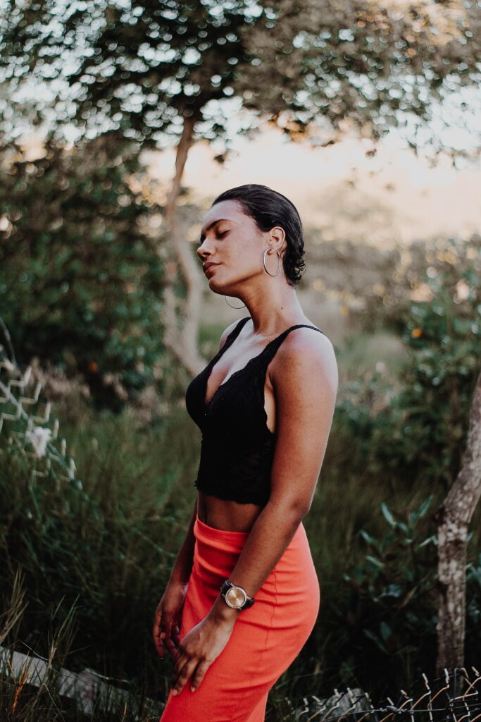
At this point, the image is nearing completion, and you can see the results below. It’s a far cry from the original, which feels flat and boring by comparison.
After editing the shadows, highlights, and mid-tones, it’s time to tweak the Blending and Balance sliders.
As I explained above, blending refers to how much each of the three parameters stays within its own range. It has a default value of 50, which results in a relatively smooth colour grade overall.
Sliding Blending to the left means the edits to shadows are confined almost exclusively to the darkest portions of the shot. And the edits to the highlights are confined almost exclusively to the lightest portions of the shot. A balance of 0 essentially makes each of the edits stay in its own lane and not affect the rest of the picture. And bringing the Balance slider to the right will increase how much each tonal area overlaps with one another. The result is often quite subtle but can have a noticeable impact when applied carefully.

Now, the Balance slider determines how much of the picture is treated as shadows and how much is treated as highlights. Moving the slider to the left takes whatever adjustments you made to the shadows and applies them to more of the picture overall. The same happens to the highlight edits when you move the slider to the right.
If you have applied a certain tint to the shadows but want that tint to affect more of the picture, move the Balance slider to the left. Likewise, if you want your highlight adjustment to apply to more than just the brightest portions. Adjust the Balance slider to the right.
Tips for Lightroom Colour Grading
The key to colour grading is to remember that there is no one magic solution. Don’t think of colour grading as a search for the right way to adjust your image. But as a doorway to infinite possibilities that can be used, however, you see fit.
The best way to learn about colour grading is to click around on the colour wheels. And experiment on your own. Lightroom is non-destructive, so you can always revert back to your earlier image. And in the meantime, you just might find a new way to edit your pictures that you never thought of before.
Some Key Tips
- Edit your image to have an even exposure prior to using the Lightroom colour Grading tool. Use the Basic panel for highlights/shadows adjustments.
- Give your shadows a richer look by adjusting them to be teal, blue, or purple
- Contrast the highlights with the shadows by making them yellow, orange, or red
- Adjust the mid-tones a little, but not too much. The mid-tones should complement the highlights and shadows, not compete by standing out.
- For subtle tweaks, use the Blending slider to control how your graded colours meld together
- Click the eye icon next to one of the colour wheels to toggle between a before and after view

Conclusion
You should now have enough to get started with Lightroom colour grading. Just remember that the goal here is the same as it is with most editing. You want to end up with an image you like! colour grading is just another tool you can use to make that happen.
As Lightroom is a non-destructive editor, you can always undo your changes. So experiment with colour grading as much as you want. You will definitely love using Lightroom to understand colour grading better.
Happy Editing!

