

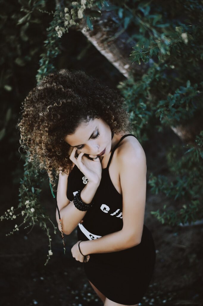
I am sure you have seen an image and immediately known who took it. That’s because every photographer has a unique style, and is known for it.
If you want to make your own images recognizable like those photographers, you might want to try a split toning lightroom style. It may happen that you took a picture, and then got disappointed because it didn’t capture the exact moment you were thinking of. Perhaps, it looked exactly like what you saw, but it was lacking something which cannot be explained.
This is one of the greatest challenges photographers face, to express a feeling or vision in a two-dimensional medium. Well, that’s what photographers do, right? One of the most underused tools in the photographer’s photo editing kit is colour.
I’m not talking about the colour of the things in your photographs, like a red dress or yellow car. What I mean is the overall colour cast, most importantly, the tone of your image.
Colours affect the way people feel. Many emotions are greatly co-related to different specific colours. So much so that there is a whole body of science around it.
Colour theory is a great place to start. Even some basic knowledge of it can help improve your photo editing skills.
Keep reading this article to learn how this works.

Beyond White Balance
Having a good understanding of white balance is really necessary. The first place where you head on to change the tone of the image is white balance. For example, if it’s a grey cloudy day outside. You might want to move the slider having temperature a bit towards the warmer side. This makes your image appear yellower or orangy, in layman’s terms, sunny. Moving it in the opposite direction makes it cooler or bluer.
Although a change of white balance of an image is helpful, it is still a necessary global adjustment as it affects the entire image. In other words, editing the tone of the image with just the white balance is of ni use. It is like a mechanic trying to fix an engine with a sledgehammer. Doesn’t make sense, right? Similarly, it may not be the right tool for the job.
To edit your image with more fine-tuned adjustments, and have greater control on the overall mood of your images, you may want to have a look at Split Toning.
Style
You always have the freedom to create your own style through many different elements, starting from lighting and composition to a specific personalised way of post-processing and editing.
This last one is where a split-tone style fits.
By using this technique, you can keep the style of your images consistent. This way, the viewer will feel like all your images belong together and would be able to associate every one of them with you and your brand.
This works great for your portfolio, your Insta feed, and your website.
Split Tone
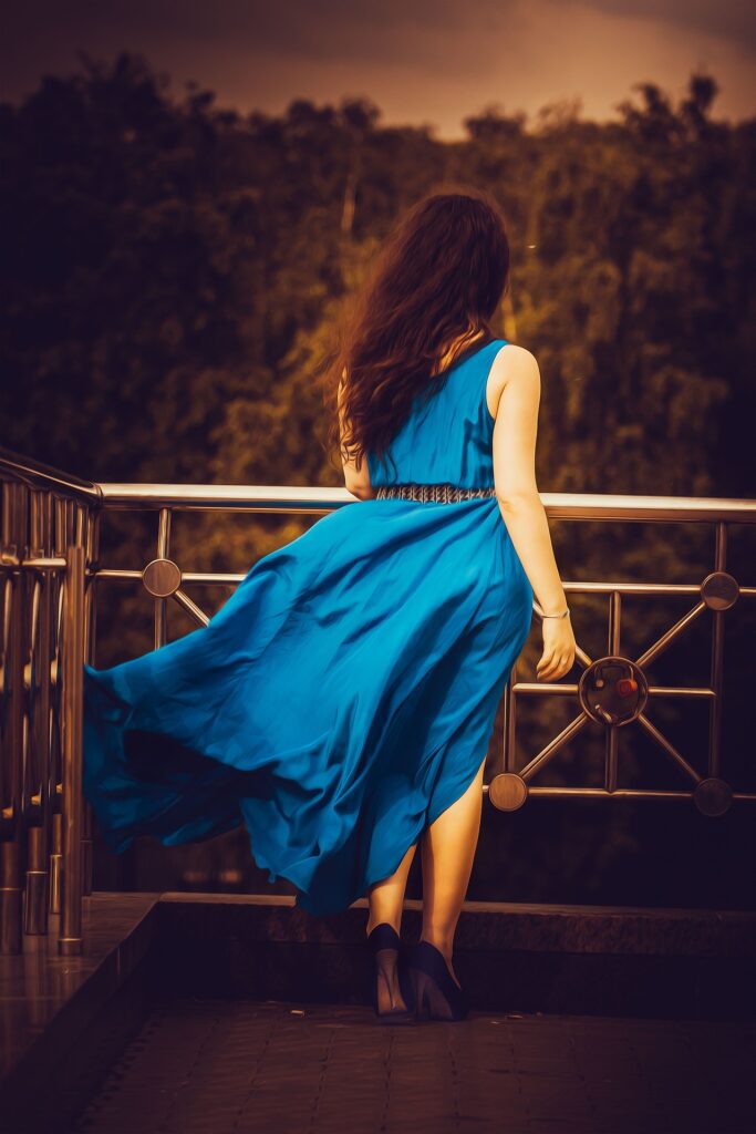
After assigning a certain tone of your choice, or a tone which suits the shadows and a different tone to the highlights, it’s known as a split tone. This concept is quite interesting and is used by many professional photographers to make their images stand out from the others.
The full white and full black portions of the image will always remain untouched. But the highlights will be cool while the shadows will be warm.
This brings the essence of the picture and makes it more realistic and relatable to the viewers.
You can also change the ratio between highlights and shadows to give it depth and contrast. It’s really wonderful when you observe the changes as to how the same split-tone colours give a different effect when you adjust the split-tone balance.
There are many different possibilities of using split-tone in your style but have the complete freedom to use any combination of colours that suits your style and brand. You can choose a colour for your highlight, and another to your shadows to meet the needs of your client.
For that purpose, you can create a colour palette.

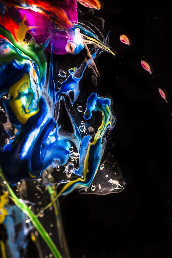
Colour Pallete
A colour palette is a range of colours used in a particular context. You must be familiar with how painters hold a colour palette in one of their hands and brush on the other. Well in the digital platform, it means the same.
These colours need to work well together and reinforce your brand or personal style.
There are several theories you can use to create your colour palette. Go through some research. Some of the popular schemes are – monochromatic and complimentary.
If you’re not sure about what to use, there are some great tools in the photo editing apps to help you. Also, you can check out the platforms like Adobe Colour or Colour Hexa for better choices and adjustments.
Just like a filter, different split tones may look better on some images than others. It completely depends on your requirements and thought process.
Experimentation
When you have a colour scheme, it gives you the flexibility to apply different split-tone combinations while maintaining your style. You will get it through experimentation.
Split Toning is much more than just things like magenta. Always try to adjust the warmth or coolness in your photographs in the split toning panel, instead of using white balance for something different.
You can also give your photos a cinematic feel, old film, vintage look, and much more by split toning. It is a great field to explore, experiment, recreate and rejoice at the same time.
Have fun, enjoy while editing, get creative, and find what works for you!
It may happen you know something which I don’t. Well, let us know in the comment section!
Happy Editing!