

Color Correction and Color Grading are the fundamental part when learning picture editing. And they are the most effortless features. So it’s absolutely crucial that you have all the tools that you will need while Color Correcting and Color Grading your pictures.
Has it ever occured to you that you clicked a fantastic picture and weren’t happy with the color grading?
I know how annoying it becomes when you have clicked an amazing picture but wants to do none to minimum editing. Then Color Correction and Color Grading are your go-to thing.
Color correction is a whole package. It really allows you to give your pictures the minimum editing with a lot of differences.
It includes tools for adjusting specific details and exact things like hues, saturation intensity, and contrast level of the picture. In addition to that, you are getting the option of adjusting the “Curves,” which is a process of editing the previously mentioned hues, saturation intensity, and contrast level. On top of this, when you add in the color balance, brightness, contrast, and the ability to dodge or burn your images, the options for color correction are numerous and just overall incredible. With these varieties of options available, there is no reason for you not to be able to color correct precisely to the smallest detail.
As it is the first step to any editing, and if you are confused as to where to start from, then Color Correction is the step you would want to opt for.
Hence, Color Correction is a straightforward start.
Every single picture you click, or anyone clicks for that matter, can benefit from just doing color correction as a start. So as color correction is so beneficial, it is a great way to start because after you are done with Color correcting, you may find that the picture doesn’t need any more editing. Color correction has the availability to entirely change the complexion, feel, and style of a picture. Having your tones and shades be vibrant and effervescent is definitely going to create a different feeling other than just softening or dulling your colors. While it seems very obvious that it’s quite a surprise how much something like color correction really can change your ideas about a simple picture. This is why it’s the best idea to start with correcting the color, as it’ll help you build and progress with your picture editing.
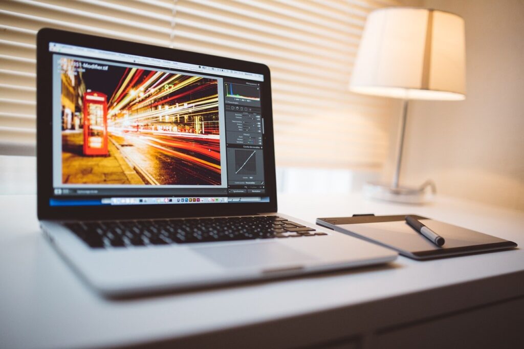
You can easily find various apps and software for Color Correcting your pictures, like Snapseed, here you can play with your tones as much as you want.
Clicking pictures in the dull natural light sometimes can’t give the right Color like how you want it to be. For this, most photographers go to edit their photos to achieve the actual color adjustment that they wish to.
In this way, photo color correction is a vital post-production service that is essential for photographers and those who use images for various purposes.
Now here is the hunch, Color Correction and Color Grading are not that different but have a fine line of difference. Do you want to know what? Then let’s find out. So basically, the Color Grading Tool is used to incorporate a specific hue into your pictures. This Color can be applied to certain areas, such as the mid-tones, highlights, or shadows, or globally all over the image. Also, with the help of two additional sliders, you can adjust and alter the effect exactly how it’s applied (i.e., if it’s intense on the darks or lights, or how much overlapping happening it is between the tones)
As a beginner, you might find, The Color Grading Tool a bit confusing and overwhelming at first use, and some might already be accustomed to the old Split Toning Tool. No need to worry, though. It is a lot easier than to what it looks like to work within the initial trials. It might look more complicated than most other tools in Adobe Lightroom Mobile, but more advanced also means it has a vast potential, and it will make your work look unique and different from the crowd. Let’s see how we can incorporate the Color Correction tool in our picture editing.
Let’s learn about how to do color correction in Lightroom Mobile
Now that you see, there’re three fundamental methods for bringing out the vibrant colors in your photographs. You can apply them together or separately for a better outcome depending on the type of complication you’re dealing with. Let’s have a closer look at them.
How to Use the Color Correction Tool in Lightroom
By now, we’ve looked at different types of layouts and various features; it’s time to find out how the tool actually works and how you can apply it to your processing work.
As you can see in Lightroom, the color wheels are pretty small to be used while working in the 3-Way mode, I highly recommend working with the mid-tones, shadows, and highlights individually. This helps with the accuracy while picture editing and allows you to adjust the bar on the Hue/Saturation slider instead of trying to shoot a shot at the wheel.
Any adjustment or alteration to the Hue, Saturation, and Luminance table made using the Shadows color wheel will, as you already might have guessed by now, only affect the shadows and not the other criteria. Some of the effects after editing, blend over to the mid-tones or highlights depending on the balance and blending values.
Using the Color Wheel Sliders
You’ll notice that nothing happens when adjusting the Hue slider until you increase the Saturation above zero. A helpful trick is to start by increasing the Saturation to a value higher than what you’re going to use. This might look not very good when you change the Hue, but it’s aiding in finding the right Color. You can then decrease the Saturation to a more suiting value afterward.
Using the color wheels can be an excellent way to find the Color you need, but I really recommend using the sliders on the wheel or bar to fine-tune it. It’s hard to get the exact color you want without doing so.
In the example below, I wanted to introduce a cold blue to the shadow areas. I started by dragging the knob inside the color wheel around until I found a hue close to what I imagined. The next step was then to decrease the Saturation to a more fair value and then use the Hue slider to fine-tune the Color.
Color Grading Shortcuts keys
Many photographers get annoyed about how delicate the Color Grading wheels are and that it’s hard to get correct outcomes. To make our work easier,there are a few keyboard shortcuts to help.
- Option (Mac)/Alt (Windows): Makes the controls less sensitive and easier to use for precise results.
- Shift: Adjusts only the Saturation.
- Command (Mac)/Ctrl (Windows): Adjusts only the Hue.
OUTLOOK :
Color correction, however, is the best and easiest way to your pictures turn amazing. However, It might not be an easy tool to use for Lightroom beginners at the beginning, but it’s one such tool that will be highly beneficial for you once you master it. Being able to color grade and color correct with this accuracy has previously required the proper knowledge and experience to explore through these features and create unique works.