
We all know what the worst fonts are.
Curlz, Papyrus, Comic Sans. But what about Best Fonts for Photo Editing? In this blog, we will get into how to select the best font that will work for you.
Font choice is an incredibly important part of designing merchandise at it can make or break a sale.
However, there is no such thing as a universal “best font” that will work for anything and everything. It is more about selecting the font that will best work for your product, brand, or audience.
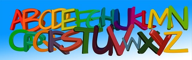
Typefaces
First, let us talk a bit about typefaces. Let’s start by defining the difference between a typeface and a font.
A typeface is a set of characters with the same design. This includes letters, numbers, and punctuation marks. A font, on the other hand, is the size and style of a typeface. While Arial is a typeface, Arial 12 point bold is a font. And a font family contains all the variation of a specific font like Arial Bold, Arial Italic, and Arial Narrow.
To understand which font might be best for you, we first have to explore the different typefaces.
Serifs
Serifs are a style of a typeface where the characters have a little nub at the end of the strokes. These nubs, on the serifs, can be pronounced or they can be more subtle. Times, Garamond, and Georgia are all examples of serifs.
Serifs are traditional typefaces and have been around for a while. They were with typewriters, and they are still used in books and screenplays. Because of this, serifs give more of a formal feel. They are generally not seen as super modern or trendy.
However, this isn’t to say that you should write off serifs entirely – there are popular brands that make the serifs feel classy and stylish.
San serifs
San serifs are typefaces that don’t have serifs. You can remember the difference because sans is the French word for “without”. So, sans serif means “without serif”.
Some examples of Sans Serifs are Arial, Helvetica, and Verdana. Sans Serifs usually convey a modern, simplistic, and minimalistic feel.
Script
Script fonts have a personal touch and are based on the stroke of calligraphy and handwriting. They are known for their flourishes and swirls, which are known as swashes.
Brush script, Pacifico, and Allura are all examples of Script fonts. They have two subtypes- formal and casual script.
Formal scripts are fancy and have over the top curls and flourishes while casual scripts have fewer flourishes and increased readability.
Generally, script fonts convey elegance, femininity, and they are unique and artful.
One of the biggest downsides, however, is the script can be harder to read compared to other typefaces. So, I recommend using it sparingly.

Decorative Fonts
Decorative or display fonts are a diverse typeface known for their distinct look. They are bold in style, unique, and original, which makes them great for decorative and ornamental purposes.
Many decorative fonts are characteristic of a certain emotion or era. Some examples are Outlaw, Horror Hotel, and Kingthings Christmas.
As decorative fonts are so eye-catching, it is important to use them sparingly so they have an impact.
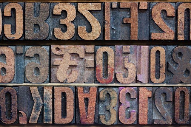
Monospace Fonts
Monospace fonts are the fonts where each character takes up the same amount of space. When characters are different widths, those are known as proportional fonts.
They were popularized with the typewriter and are commonly used in code and screenplays. They are generally more bookish, serious styles like Courier, Valkyrie, or American Typewriter.
Font Choice Tips
Now let’s get into some tips about how to choose the best font for your merchandise design.
Brand Style
- The first thing that you should be considered while selecting a font for your brand is your brand’s style. Establish brand style guidelines to ensure your brand has a well-defined style and is consistent in its aesthetic. Define your style first then choose a font that suits this style and avoid using just any font that you like.
- For example, if you want to take your message seriously don’t use comic sans.
- Using the same fonts in your merchandise over and over again will also strengthen your band’s appearance. If you keep it consistent, your clients will recognize your style straight away.
- Resist the temptation to use that cool new font you just found and ask yourself the question: Will it fit in with the style that I have already established?
Simplicity
- As I mentioned before, simplicity is the key when choosing a font that will stand alone or that is meant to be cohesive in a more involving design.
- When design a logo it can be tempting to pick a complicated, unique font so your logo stands out. But try to avoid it!
- Very curly handwritten fonts used to be a huge hit, and are still quite popular but they are not best for logos. They are difficult to read and make logos look clutter. Readability can be a huge issue with these complicated fonts.
- Limit your design to 2-3 fonts out of which no more than one should be complex.
Avoid thin fonts
- When designing merchandise, it’s important to keep in mind that thin fonts work well for digital designs but they are not suited well for printing or other types of customizations.
- Usually, when printing thin fonts aren’t very legible and may cause technical issues.
- Some major fonts you should avoid are Comic Sans, Times New Roman, Papyrus, Helvetica, and Arial.
Conclusion
It’s important to keep in mind that fonts can be subject to copyright too. So make sure to check the license before you download them. Always ask for feedback on your team while you are designing.
Feedbacks are important also for us. So please let us know in the comment section:
Which of these tips are you going to use in your design?