
Photo editing trends move fast as a train on Instagram. Remember the time when your feed was full of square-cropped photos?
That was only some time ago, but in this year that style looks so back-dated. What seemed like an interesting and original photo composition some days before, can quickly become a cliche.
According to data, an average Instagram user spends almost half an hour each day on the app. It means that photos that looked fresh a year ago have already lost their sparkles. To grab their attention, you would want to be up-to-date with the latest Instagram photo editing trends.
In this article, we’ll take a look at some of the current trends which are popular on the Insta feed. Also, we will predict and tell you what we think is going to gain popularity in the future.
Dark and Moody
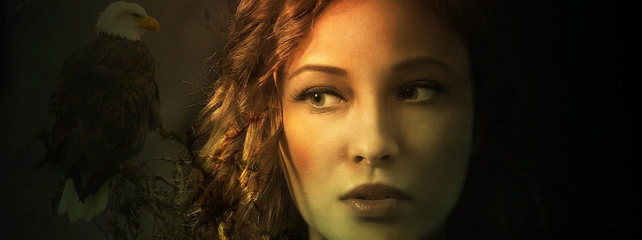
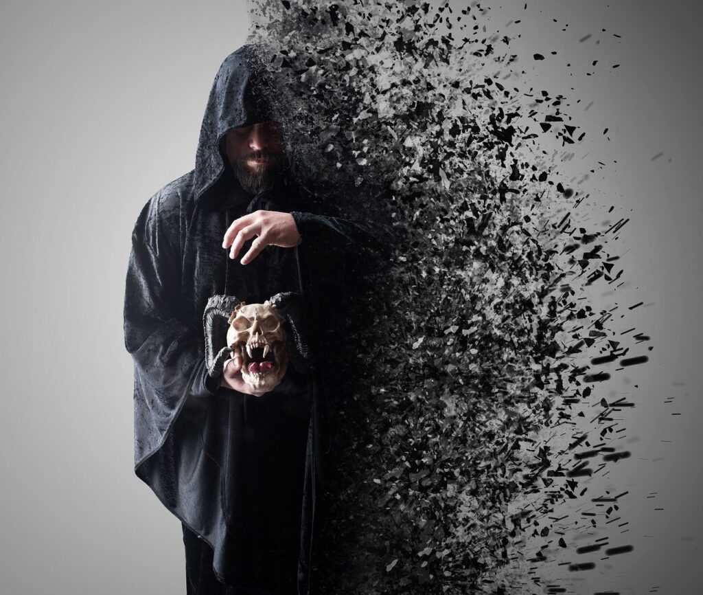
Dark and moody images are fairly recent. They are very popular. These photos tend to have a darker tone. They have a bit more neutral and muted colours. It gives your images a bit of a cinematic feel to them.
Some specific tones, somewhat like orange, red, and yellow are not vibrant but are highly saturated. Whereas, colours like greens and other cooler tones are less saturated.
Dark and moody colour palettes include colours like forest greens, purples, maroons, navy blue, dull golds, silver, and grey.
Some Issues you should be aware of:
- The skin tones will tend to lean toward orange, and may not always represent true-to-life, and seem unnatural.
- It is hard to maintain consistency between the indoor and outdoor shoot.
- It is not suitable for prints. What seems romantic and moody may turn out muddy in your prints.
Light And Airy
These type of photos are white and bright. They lean towards a more cheerful and whimsical feeling. Though it’s not completely true you can’t have serious light and airy photos.
But generally, the tone used is for feeling happy and bright. These tones are soft, and skin tones lean toward smooth and creamy.
Light and airy is extremely popular for both wedding and portrait photographs. Many such presets and editing techniques already exist, but this style is also achievable in-camera.
Photographers often shoot in light environments, where they have access to a lot of open space with fewer greens, and shadows. They prefer color palettes which lend toward the style. It includes lots of pinks, blues and yellows, and some other neutral colors.
Some Issues you should be aware of:
- When you get those bright colors, it often blows out the sky. So when you print a whole lot of your image will be pale, and the sky will seem white.
- Light and airy presets having greens become minty. Also, pink tones seem too rosy which can be irritating for some. So have a watchful eye!
- This mood lacks contrast which makes it feel lifeless.
- Many people confuse light and airy with simple overexposing of the image.
Black and White
Black and white images have suddenly become increasingly popular. Maybe people want to go back to old times.
Most of the photographers don’t edit in black and white. Rather, they will click several black and white images together with other color images.
It may seem simple but, you will be amazed to know that there are different styles of black and white in itself. Also, black and white images can have a hint of color to them.
Some people prefer their black and white with some hints of blue or red. Others like a bit more contrast to make them pop out.
Something you should be aware of:
Whatever B&W style you choose, it should always compliment your color editing style. For example, you will not choose a dark, gritty black and white editing style to go with a light and airy color style. Isn’t it? The two images wouldn’t go with each other and will seem unnatural. Your black and white images should be able to merge with your color images.
Earthy
This style is very similar to the dark photo editing.
Some people call it the desaturated style. As that name implies, with earthy images, all the colours are very muted, and which gives you a dusty feeling.
In this style, the reds, greens and blues are presented in a desaturated way as compared to their original vibrancy. These images also give you a bit of cinematic feel. Sometimes they also involve the use of a subtle matte, or even haze, added to the image.
Some issues to be aware of:-
- Desaturation of the images while editing can alter the colors which may not seem true to life. For example, a blue jacket might look grey. Hence, they aren’t suitable for printing!
- Skin tone in this style leans toward a bit creamy texture but can end up looking washed out and pale.

Conclusion
Your photo editing style can take a bit to work out. And it’s an entirely your personal decision. You eventually start improving as you practice daily.
Shoot and edit in a style that you find attractive and interesting. If you love any specific look, go for it. But you should be aware that a style can fall out of demand really soon.
What’s hot right now might not still be hot in the following few years. People change, their mindset change, and hence, their choices change!
Comment your opinion below!
Happy Editing!