
If you are somehow familiar with Photo Editing and Photography, then you must hear the word Contrast.
“Contrast” is a very important component in photo editing. This blog will show you how you can improve your photos by adjusting the contrast or enhancing.
If you know how to manipulate contrast in photography, it will change your images for the better.
Now, let’s have a look at what you need to grab!
What Is Contrast in Photography?
The literal meaning of contrast is the difference. In editing, the differences can be achieved by changing the tones which compose the image.
‘Contrast’ has always been a key element. It is the degree of difference between different elements of an image.
Lower contrast will give your image a different feel than a higher contrast.
The type of contrast can also influence your images.
Understanding Color Contrast
Creating an interesting colour contrast photo requires some basic knowledge of colour theory.
This is where Colour Wheels and the Colour Schemes come in.
The Color Wheel is a chart used in paintings which represents the relationship between various colours.
Using Color Schemes, you can figure out the combinations having the most contrast. The complementary colours are the most contrasting combination.
It is very easy to recognise complementary colours since they are located opposite to one another in the Colour Wheel. One common example is green and red.
As an alternative, you can classify the colours into two categories: warm and cold.
Combining a warm colour with a cold one will result in a contrasting colour photo.
Understanding Tonal Contrast
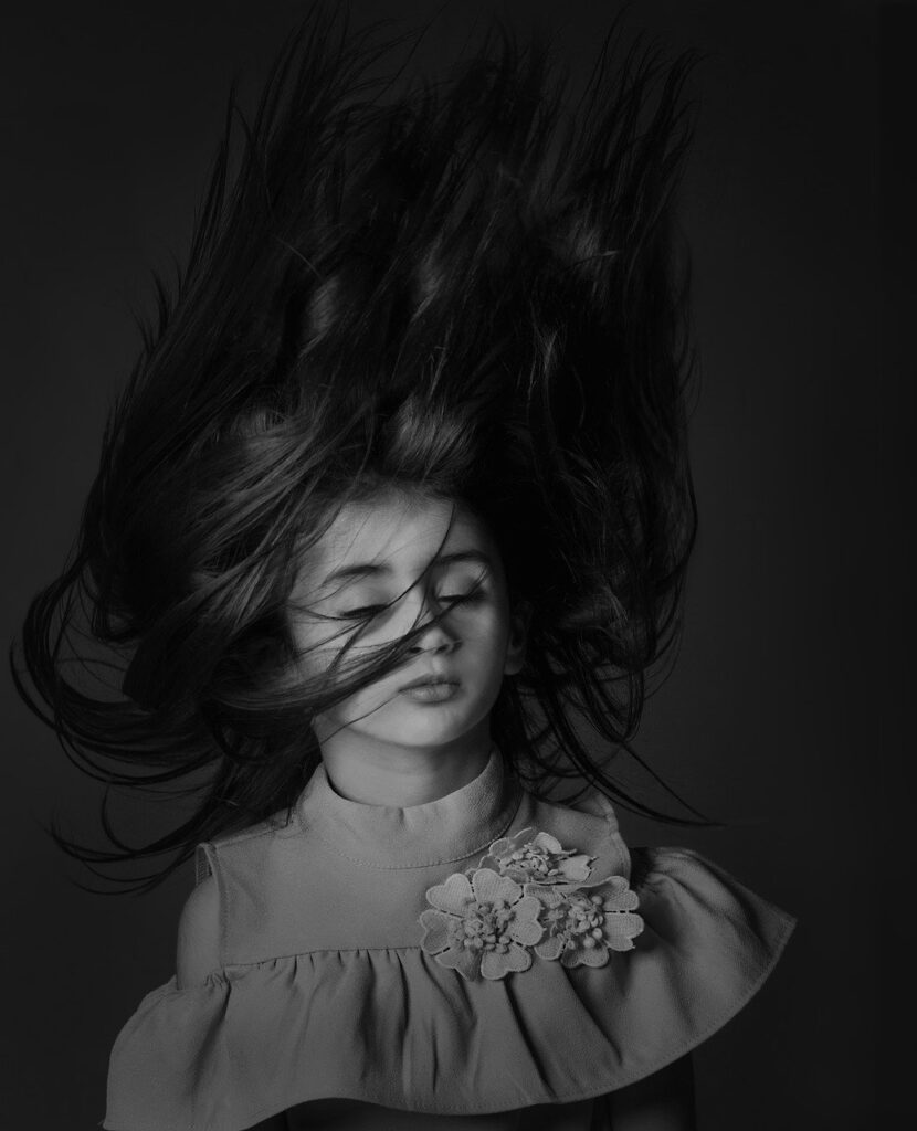
The best type of contrast is tonal contrast which refers to the relative brightness between the elements of the image.
Tonal contrast is exclusively relevant in B&W images. These lack colour contrasts, and other ones.
In layman’s terms, if the image has both extremely dark and bright tones, it has high tonal contrast.
A photo having a wide range of tones from pure white to pure black is considered as a medium contrast image.
If it has a range of middle tones but lacks pure whites and blacks, the photo is of low contrast.
There are many other interesting contrasts!
Use Analogous Colors for Low Contrast Images
Some colour combinations result in less contrast as they are harmonious, such as analogous colours. These colours are adjacent on the colour wheel.
The colours have some slight contrast between them for differentiation.
A great way to create contrast with similar colours is by including an element with a different shade. It may not be a strong contrast but it will make the subject stand out.
Another tip about colour contrast in photo editing is always keeping it simple. Having fewer colours in your image creates a strong contrast effect because of its dramatic look.
Contrast Using Textures
Contrasts in texture is also a great way to create wonders in photo editing.
You can combine roughness with the soft elements for giving the image an extra punch.
It can be done by making use of the background. For example, If the subject has a roughness, place it in front of a soft background. It can be a clear sky or a flat wall.
If you don’t have a clear background, you can use the depth of field to soften it. Using a wide aperture lens, and placing the subject farther from the background will create the required effect.
The background will appear blurry but soft. It will stand in contrast with the texture of your subject.
Similarly, if you have a soft element, it will pop out in a textured background.
Using Contrast to Convey a Particular Mood
Contrast is very useful for conveying certain moods through your images.
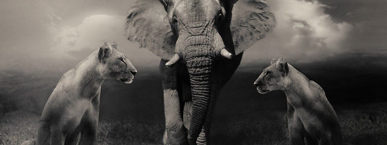
High contrasting images stand out, show textures in the subject and give a feeling of high strength and energy. High contrast is usually used in street and nature photography.
Low contrast images tend to have a dreamy, and sad feeling. Low contrast works well for outdoor portraits, especially if you want a vintage feel.
Before pressing the shutter, always think about the feeling and mood you want to convey. Then look for the types of contrast that will make it stand out.
Practising Contrast in the Field
For tonal contrast, something which helps a lot is setting the camera to black and white. This is a trick I learnt from Gala Martinez, a portrait photographer from Barcelona, and I like it!
Taking out the colour helps you to focus on the light intensity and its effects on the image. You can also try strong light-shadow contrasts.
You can also start training in contrast along with building your scenarios. Go to the general arts and crafts store and get a couple of cardboard. Paint them white and black as they are great for tonal contrast.
You can use these as backgrounds for the subjects of different colour that you want to experiment on.
You will be amazed to see how the different combinations affect the contrast of the final image and bring out the emotion and feelings behind it.
Conclusion
If you are a photographer, contrast is going to be a crucial element to consider in all your shots. It helps to convey a mood or a message to the viewer.
Tonal contrast is the best-known, but there are other types such as colour and conceptual contrasts. You can train yourself in such a way to see contrasts around your surrounding. You can also arrange the scenarios according to understanding to achieving the result you want.
Lightroom, Photoshop and other photo editing software have great tools to give that final touch to your image!